
Pattern Library
Every approved component, on one page.
The reference sheet for building Niagara Transit pages: cards, badges, callouts, steps, lists, stats, splits, route pills, buttons, accordions, tables and video, each shown in its approved white and wash treatments.

Cards on a white section
On a white section, cards take the #F0F0EE wash fill and their badges are white. No borders, no shadows, 10px radius, one wrapping row.
Info card
Badge, h3 title, then body copy. The badge always leads the card and its text is always #000014.
Another info card
Cards in a section live in a single wrapping row: six cards render as 3 + 3 but are one row in markup.
Link card
A card whose destination lives on an arrow button. The card title is reused as the link text.
Cards on a wash section
On a #F0F0EE section the alternation flips: white cards, #F0F0EE badges. The section icon circle inverts too, a white glyph on a teal circle.
White card
Identical structure to the white-section card; only the two fills swap.
Stage card
Roadmap stage cards are the same pattern with a stage badge and a plain list:
- First milestone
- Second milestone
Equal heights
Rows stretch cards to equal height regardless of copy length.
Callouts
Three approved callout forms: info (blue tint, teal left border), warning (amber), and the plain neutral box.
Info callout. A blue-tinted box with a 4px teal left border, for helpful context that shouldn’t interrupt reading.
Warning callout. Amber border and warm tint, with the warning icon, for service alerts and cautions.
Neutral callout. A plain #F0F0EE rounded box, the form used for the plan-your-trip strip on the Destinations page.
Badges & route pills
Inline pills flow with content; card badges are block (see the card sections above). Route numbers are teal pills; GO uses its green with a 5px radius.
Sample local route
Paired routes
GO Transit connection
Numbered steps
The default form is a plain ordered list (theme counters). Only genuinely boxed drafts use the card variant with a numbered pill.
1. Plan
2. Board
3. Ride
Boxed step
Card variant: teal numbered pill, title, body.
Second step
The same card rules apply, fills alternate with the section background.
Third step
Use sparingly; the plain list is the default.
Styled lists
Decorative markers are dropped; lists are plain. Only a semantic do/don’t pair earns icons.
- A plain list item, styled by the theme
- Another item
- A third item with a link
Do
- AI-Powered marketing strategies
- Live customer support chat widget
- Automatic scaling campaign tools
- Adaptive testing/reporting
Don’t
- AI-Powered marketing strategies
- Live customer support chat widget
- Automatic scaling campaign tools
- Adaptive testing/reporting
Stat row
Big numbers are display-only text (no heading tag) with a plain-text label beneath.
12
3.50
2 hours
100
Two-column split
Prose beside a tinted aside that carries the section’s action.
Content column (3/5)
Longer-form copy sits here: paragraphs, links and lists inherit theme styling. The aside carries a centred heading, a short supporting line and a call to action.
Splits can also be 1/2 + 1/2 where the two sides carry equal weight.
Aside (2/5)
Short supporting copy.
Accordion
Closed by default; each question renders as a real h3 in the DOM.
What makes an accordion question accessible?
The toggle carries both heading attributes, so the question is a real heading for screen readers.
Can answers hold rich content?
Yes, any HTML: paragraphs, lists, links, even a full data table for a “show full table” disclosure.
When should we use one?
FAQ runs and long optional detail. Primary content, like the fares table, stays open on the page.
Data table
Real table markup with a caption, header row and scoped headers, kept verbatim.
| Rider | Cash | Card | Monthly pass |
|---|---|---|---|
| Adult | $3.50 | $3.00 | $95.00 |
| Senior / Student | $3.50 | $2.75 | $80.00 |
| Child under 12 | Free with a fare-paying rider | ||
Video
Videos embed responsively through the registered video element from a plain YouTube URL.
Ready to build a page?
Every component above is approved. Copy the block you need, keep the alternation rules, and flag anything off-palette.
New things begin here
A Section of Handy Links
Standout Cards with info and button
Standout Info Card
This card can be a bit more styled
Standout Info Card
This card can be a bit more styled
Standout Info Card
This card can be a bit more styled
Keep everyone aligned and engaged with tools designed for real-time collaboration.

Meaning
Strengthen connection
Bring your people together through meaningful rituals, guided team-building exercises, and shared experiences.
Insight
Culture pulse & insights
Stay in tune with your team through lightweight check-ins and clear engagement data, giving leaders visibility.
Culture
Recognition & shared wins
Create a culture of appreciation with built-in recognition tools that make it easy to celebrate milestones.
Proven results with innovative AI features
Thousands of teams trust Tether to deliver measurable ROI, unlock greater productivity, and harness the power of AI.
The choice of thousands
Over 8,000 clients trust Tether to connect their teams
+4
Average increase in team productivity following our operational audits
92
Of clients report measurable ROI within 90 days of using Tether
Everything you need to know
What exactly is Tether?
Tether is a SaaS platform designed to help teams build stronger connections through real-time collaboration, guided team-building exercises, and meaningful rituals. It keeps everyone aligned and engaged, whether working remotely or in person.
How does Tether improve team collaboration?
Tether provides tools for real-time communication, shared rituals, and structured team-building activities. By integrating these into daily workflows, Tether ensures teams stay in sync, feel connected, and work together more effectively.
Can Tether work with remote or hybrid teams?
Absolutely. Tether is designed with flexibility in mind, making it ideal for remote, hybrid, and in-office teams. The platform helps bridge distance by creating shared experiences that keep people engaged no matter where they’re working from.
What makes Tether different from other collaboration tools?
Unlike standard productivity tools, Tether focuses on strengthening human connection. It combines collaboration features with rituals and team-building practices that nurture culture, trust, and alignment—not just task management.
Does Tether integrate with the tools we already use?
Yes. Tether is designed to fit seamlessly into your existing workflow. It integrates with popular workplace tools so your team can stay connected without adding extra complexity.
Create loyal customers that love your brand
Retention is key to successful business growth. Our platform gives your customers a better experience from start to finish in order for you to easily turn them into lifelong fans.
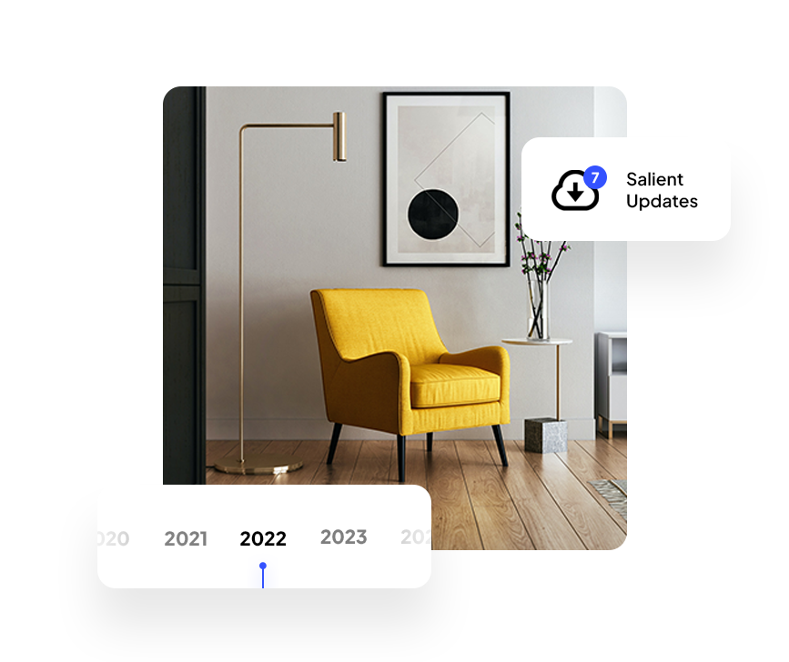
Free Updates for Life
Over the past 10 years, we’ve consistently released updates with new features and fixes. You’ll get free access to all future updates with a single purchase.
Google Fonts
Choose from over 1,400 Google fonts with powerful responsive typography settings.

Blazing Performance
Salient is Built with modern tooling and includes a suite of simple to use, yet powerful performance options created to target page speed scoring. View the report from GTMetrix or Google Lighthouse.
AI driven solutions for exceptional outcomes
- AI-Powered marketing strategies
- Live customer support chat widget
- Automatic scaling campaign tools
- Adaptive testing/reporting